Building web content that works for all audiences
|

Making effective web content can be more daunting than it first appears. Whether you’re updating a popular page or starting from scratch, the finished product has to work well, look good and bring value to all audiences. If you’re looking for a place to start, make sure the content works for everyone!
Consider people at every step
Ideally, the process of launching web content involves:
- Conducting user research
- Creating a content strategy
- Establishing a visual identity
- Developing and testing your website
- Writing the content
The amount of effort and resources you dedicate to these areas will increase your content’s chances of success and sustainability.
Regardless of how much time you can devote to each individual area, consider the people who will read your content at every step. Aim for a diversity of experience and perspectives in your user research to help your content meet every audience’s needs. Make people a priority when building your content strategy and visual identity (more on this later). And when you write, test and deploy code or content, use the tools available to make sure your final product’s accessible to everyone.
This includes people with varying abilities related to language proficiency, visual perception, physical mobility, cognitive processing, neurological conditions and more. The companion guide to Web Content Accessibility Guidelines provides simplified best practices for creating accessible content.
Iterate for everyone

If you want to boost the viability of your Minimum Viable Product, focus on launching with an accessible, plain language experience.
Your launch establishes a strong foundation for future improvements, but web content is never truly “finished.” After the page goes live, continuous iterations and updates based on feedback should be a part of its lifecycle. Focusing on people can extend far beyond the launch date of your content.
Planning for ongoing refinement after launch allows you to address omissions or oversights, provide updated information to your audience, and fix any page issues which may come with advancing technology.
Keep aesthetics usable

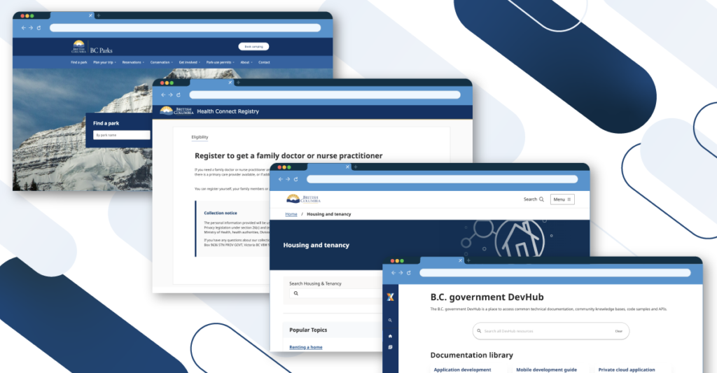
While the visual appeal of a website draws people in, usability determines their stay and interaction. A cohesive, engaging and inclusive online presence will deliver a smoothly accessible experience along with appealing aesthetics.
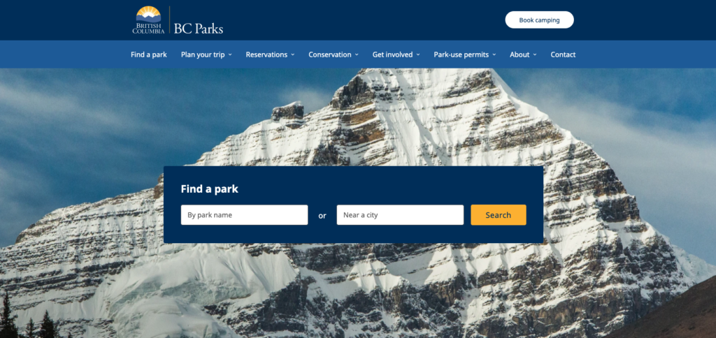
Aesthetics can impact first impressions, brand perception and user engagement. Elements like colour scheme, typography, imagery and overall layout contribute to the content’s appeal.
Meanwhile, usability encompasses the ease with which users can navigate your website and find the information they need. This includes aspects like:
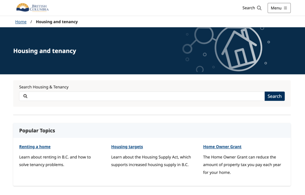
- Intuitive menus, links, drop-downs, breadcrumbs and search functionality
- Legible fonts, appropriate text sizes and contrast ratios
- Fast loading speeds
- Mobile responsiveness
- Behaviours on interactive elements like buttons, forms and calls-to-action
Being thoughtful about your content’s visual design, and how your audience will respond to it, helps attract people to your content and hold their attention.
Use your resources

Making content that works for everyone isn’t easy, but there are resources available to help.
- The BC Government Design System provides a range of consistent user interface elements that can be easily integrated into online services
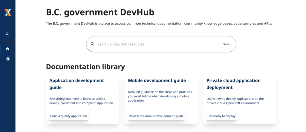
- The BC DevHub collects technical resources in one place to help teams build digital products for the B.C. Government
- Plain language training is available for anyone in BCPS who wants to write simple, accessible content
- The Digital Code of Practice provides guidance on digital government operations and delivering improved services to citizens
- The GDX Service Design team partners with government programs to design services that work for people who live in B.C.
For best practices in visual formatting, layouts, colours, word choice and more, refer to the Web Style Guide.
