How we designed and developed digital.gov.bc.ca
Our deliberate and thoughtful design is focused on simplicity, accessibility and usability, with the goal to create consistent content across all B.C. government platforms.
If you have a formatting, editing or writing question that we don’t specifically mention, refer to our content style guide.
Last updated on
Our design inspiration
Government jurisdictions design systems
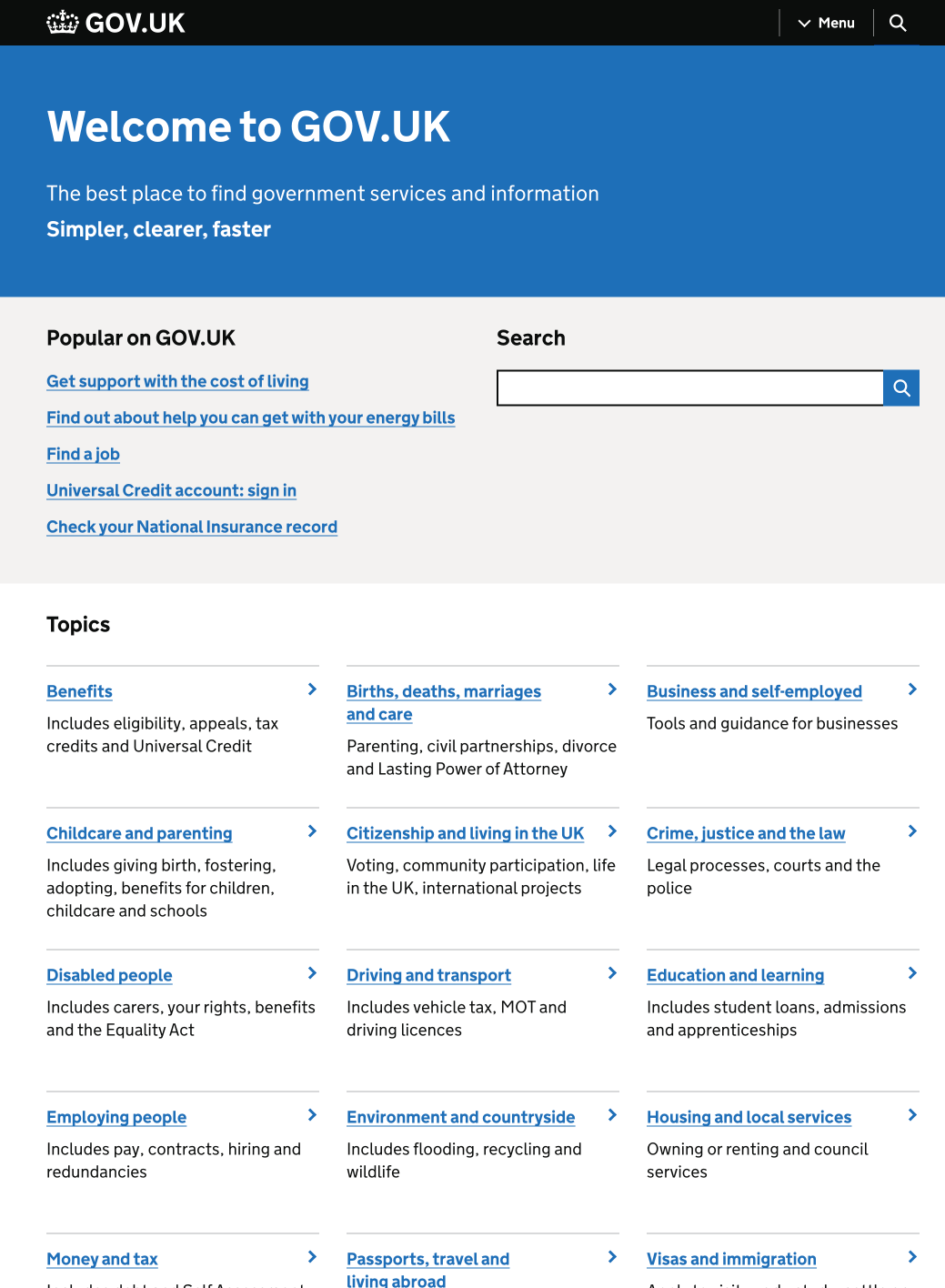
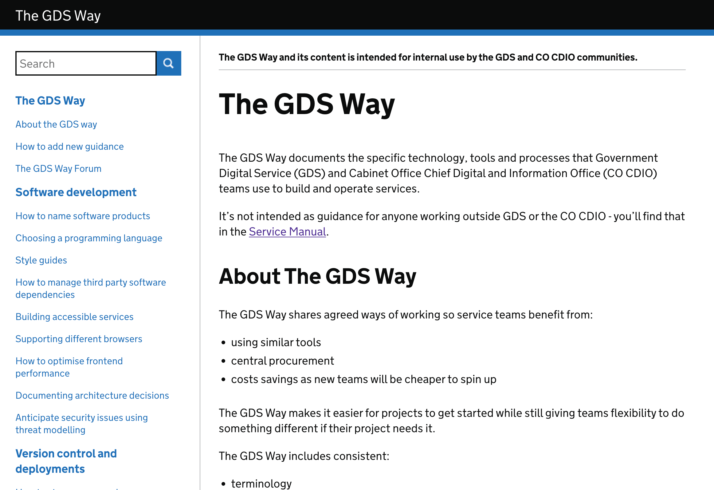
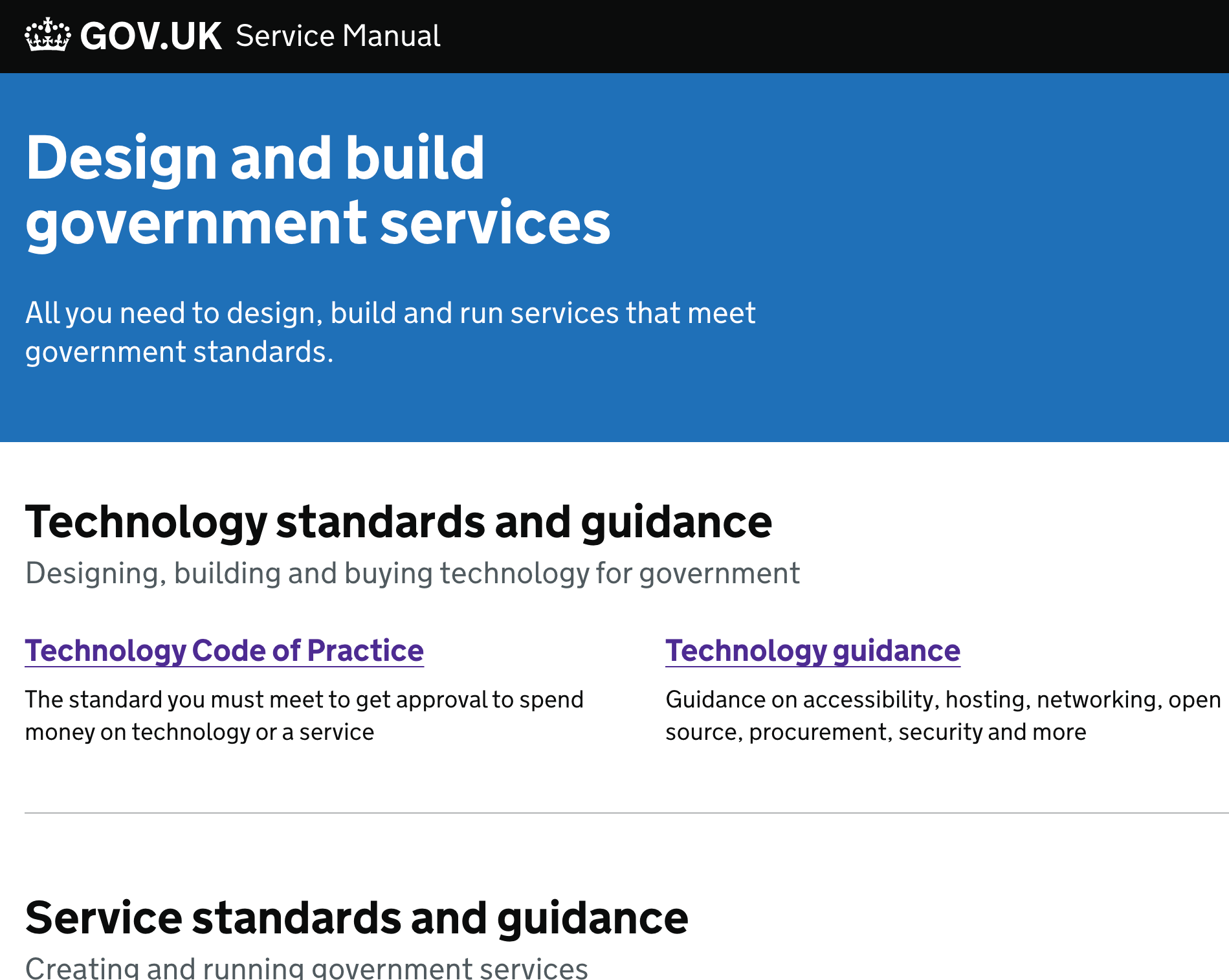
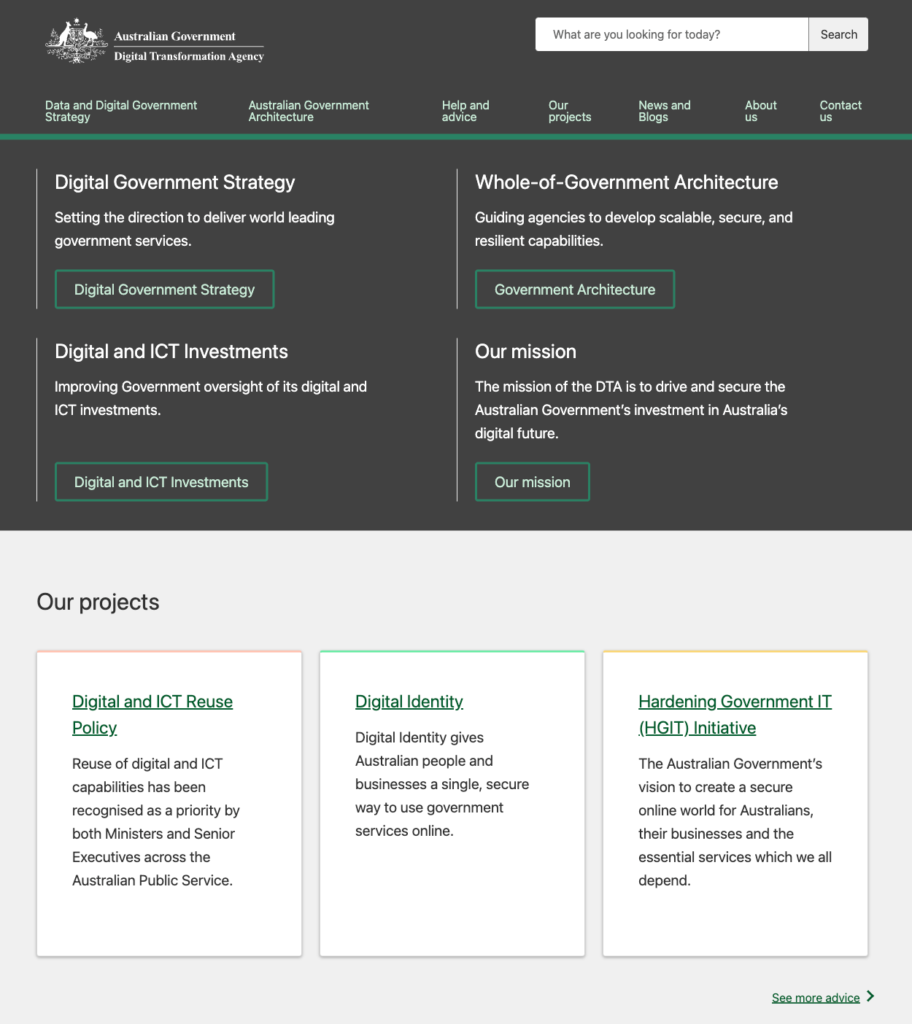
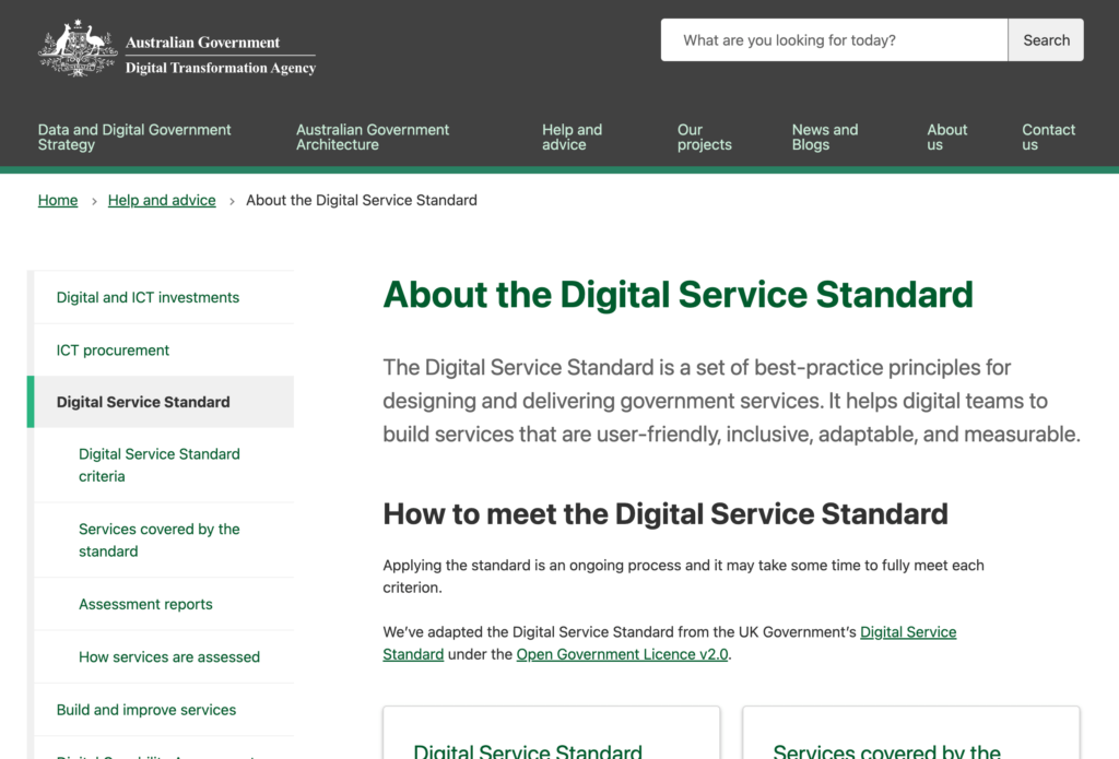
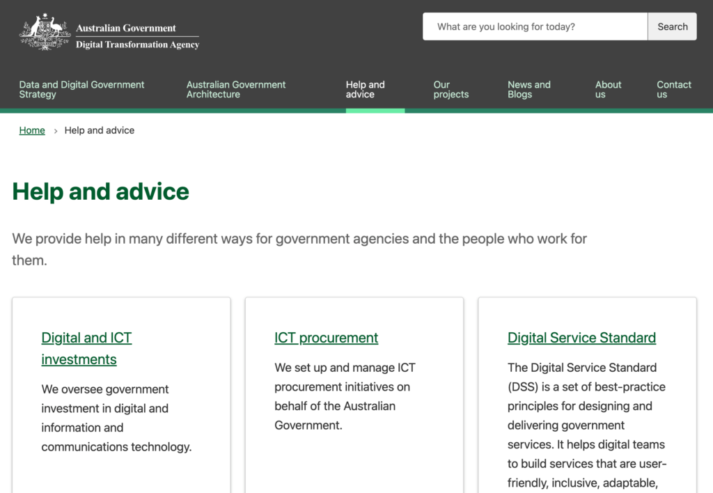
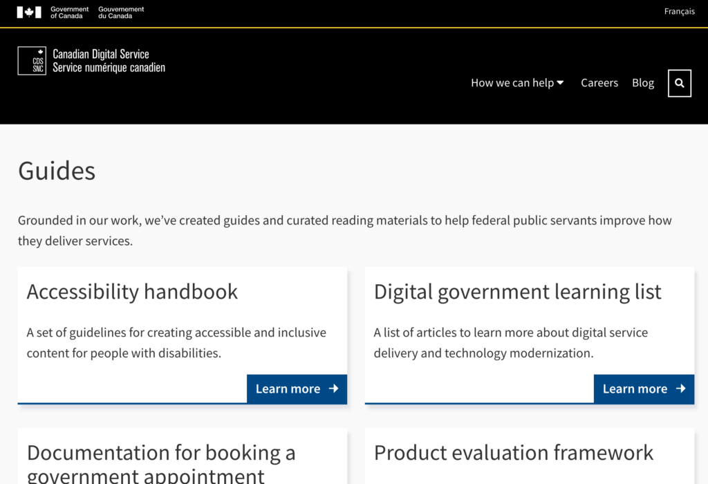
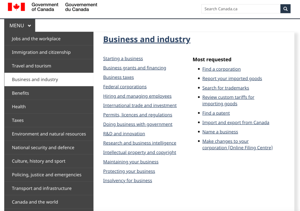
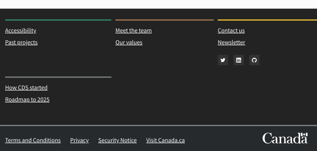
The digital.gov.bc.ca design is inspired by digital government design systems from the United Kingdom, Australia, New Zealand, Singapore, Denmark, Canada and of course, British Columbia.
United Kingdom
Australia
Canada
Collaboration with the gov.bc.ca design team
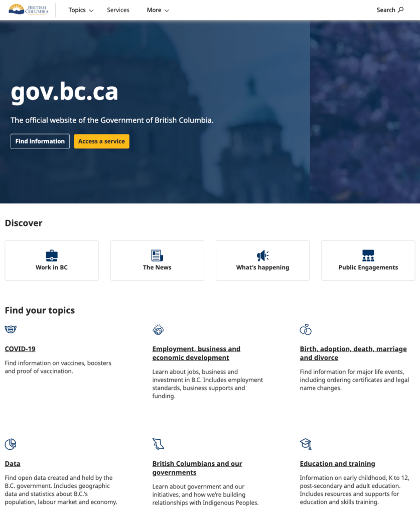
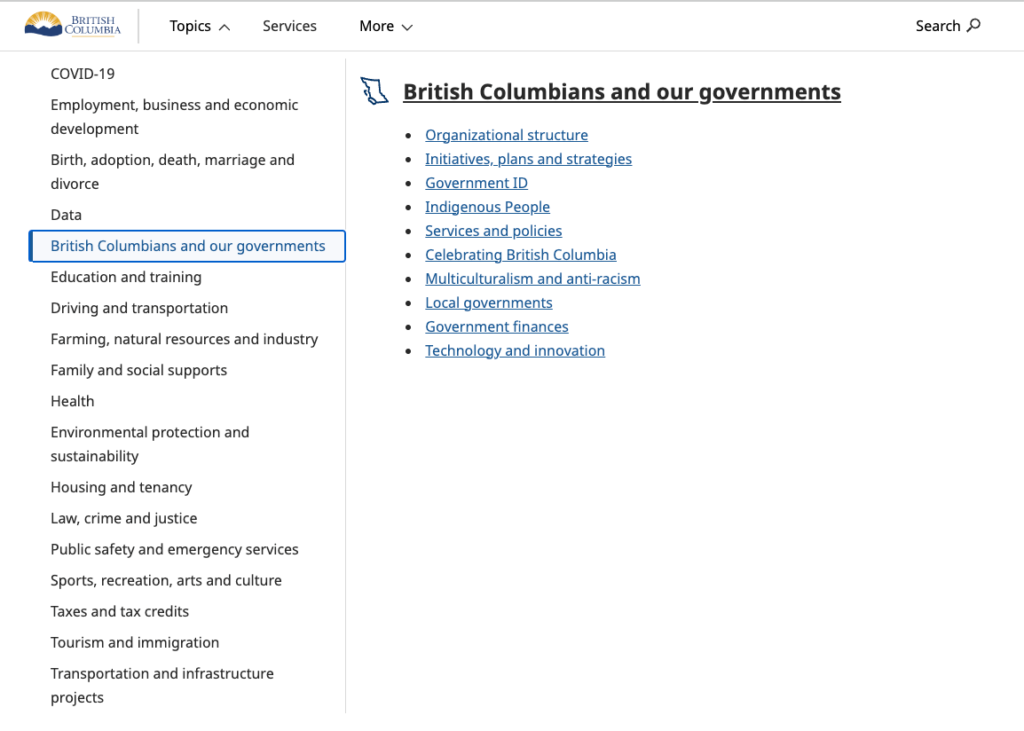
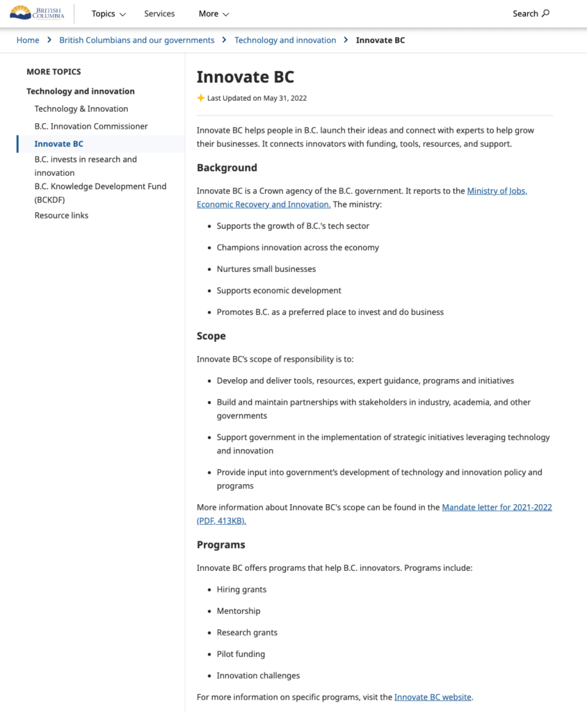
digital.gov.bc.ca has been developed to have a very similar look and feel to the new design of gov.bc.ca, so people moving between platform have a cohesive experience. Maintaining consistency within government service platforms can build trust within an audience, allowing them to navigate and interact with digital services more intuitively.
gov.bc.ca Alpha design
Accessibility considerations
We’ve focused on 3 key areas to make digital.gov.bc.ca accessible.
Assistive technology
By focusing on simple design, limited imagery and text-based content, we’re creating accessible content for people who use assistive technologies. These design choices also enhance the website’s performance and reduce page load times.
If there is a real user need for visual aids, images must be accompanied by alt text:
- Alt text is important and should be provided for images, describing the visual details or content of the image concisely and meaningfully
- Good alt text provides relevant information, is specific and avoids repetition or unnecessary details
Performance optimization
Images, especially large or high-resolution ones, can significantly impact the loading speed of a website. By minimizing or eliminating the use of images, websites may load faster. While this improves the experience for all visitors, it’s especially important for visitors who have low or limited internet access.
Faster loading times also contribute to better search engine rankings.
Mobile responsiveness
Simple designs and minimal imagery work well for mobile devices, where screen size is limited. Optimizing for mobile viewing is crucial in today’s mobile-driven world.
User experience
Design research and usability testing
Design research and usability testing play a key role in enhancing the design of our information. Through research interviews and website testing, we gather valuable feedback from public service employees and identify areas of improvement. We then make design and writing changes based on this feedback.
A focus on content
A simple and minimalistic design lets content take centre stage. It involves structuring and presenting the content in a clear and accessible manner to allow users to easily consume and understand the information.
Why we use WordPress as our content management system
A previous iteration of digital.gov.bc.ca was built with a content management system called Strapi. The content was mixed in with code, which meant that any content updates had to go through the developer team to be published. This created barriers for content creation.
We wanted to enable authors to publish content independently, while also providing readers with a broad range of features required to support their digital modernization journey.
Through discovery research, the development of a user persona and a digital transformation journey map, we were able to identify what was needed to make this happen.
Developers performed a landscape assessment of various content management systems to find the right platform. We chose WordPress because it enables us to:
- Easily align with B.C. government styling and accessibility standards
- Introduce the novel Gutenberg block editor to assemble content without the use of code
- Streamline the technical work and content design processes
- Use a low code development approach
- Implement the BC Government WordPress Block Theme, developed by GDX’s Digital Engagement Services, to offer teams the ability to easily work with pre-designed templates
How the website is rendered
Rendering is a process used in web development that turns website code into the interactive pages users see when they visit a website.
digital.gov.bc.ca is rendered in 4 layers:
- BC Government Block Theme
- Templates
- Custom patterns
- Scripts, custom styles and embedded applications
These layers are built upon each other to create a more unique look and feel.
Customizations may or may not require development intervention, depending on their complexity. A lot of basic customization can be done by editors through the functions provided above, without developer intervention.
Enabling shared governance
We want to work with digital government subject matter experts (SME) to collaboratively maintain and update digital.gov.bc.ca.
By empowering teams to easily edit and add content, we hope to foster a sense of ownership and efficiency to enable faster development and content launches.
